Theme settings Manual
From this section you can setup colors, backgrounds and various visual settings of your document, at a global level.
Note: In order to modify your document theme settings, please click the  button in AbcSubmit editor application toolbar.
Importing themes

It is recommended, before you customize your form theme, to start from a predefined theme, in order to save some (or a lot) of time. You can import a theme by clicking on the  button, and select a theme in the popup window that will appear:
1. Document
1.1. Background color
Sets a solid background color of your document.
1.2. Background image
You can upload a picture that will be used as the background image of your document.
Note: Uploading pictures requires a premium user account, because file storage is a paid feature.
1.3. Background position
In case you upload a background image, from this setting you can adjust the position where the image will be displayed on the background overlay of your document.
1.4. Background repeat
In case you upload a background image, from this setting you can adjust whether the background image is painted repeated (on X axis, on Y axis, on both axis) or not.
1.5. Background size
From this setting you can adjust the size of the background image in case you upload one.
1.6. Background scroll
Sets how the background image will react to document scroll: Stay unmoved, or scroll together with the page.
2. Page
From this group of settings you can set the default visual appearance of all the pages from your form / website. Note that individual page appearance settings will override these settings.
Also, the default visual appearance of the header and footer elements of your form / website are affected also by the Page settings from the Form theme.
2.1. Border (of pages)
Use this group of settings in order to modify the default page, header, and footer border settings
2.1.1. Border width (of pages)
Affects the default border width of all your pages / header / footer elements of your form / website.
2.2. :normal (page state)
A Page element supports only a single state: normal state (default state). This means that the user cannot perform interactions in a direct way with a page / header / footer (for example, a page cannot be focused, and when the user’s mouse pointer is over a page / header / footer, nothing happens).
This group of settings control the default visual appearance of your pages / header / footer elements of your form. Note that individual element appearance settings will override these settings.
2.2.1. Background color (of pages)
Set the default background color of all your pages / footer / header elements from your form / website.
2.2.2. Border color (of pages)
Allows you to set a default border color of all your pages / footer / header elements on your form / website.
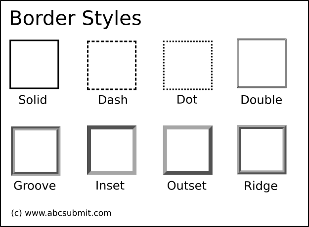
2.2.3. Border style (of pages)
Allows you to set a default border pattern used to draw the border of your form pages / header / footer elements.
3. Input
From this group of settings you can control the default visual appearance of all the inputs (fields) from your form / website. Note that individual field appearance settings will override these settings.
3.1. Text (settings of inputs)
From this group of settings you can control the default text settings that a form input / field will use when it’s rendered on screen.
3.1.1. Font face (of inputs)
Sets the default font (face/family) that is used by the form fields.
3.1.2. Font size (of inputs)

Sets the default size of the font that is used by the form fields.
3.1.3. Font style (of inputs)
Allows you to set the default font style (Bold, Italic, or Underline) rendering used by your form fields.
3.1.4. Text alignment (of inputs)
Allows you to set the default text alignment of the font (where applicable) used by your form fields. Allowed values are: LEFT, CENTER, RIGHT, and JUSTIFY:
3.2. Border (of inputs)
Use this group of settings in order to set default border related settings for your fields / inputs. Note that some type of fields do not support border (for example, a radio group, a checkbox control).
3.2.1. Border width (of inputs)
Allows you to set the default border width of inputs which support border.
3.2.2. Rounded corners (of inputs)

Allows you to set the default roundness of the corners of your form inputs. Note that some type of fields / inputs do not support rounded corners (checkbox, radio group, etc.)
3.3. Normal input state (:normal)
A input is considered to be in it’s normal (or default state) if the following conditions are met:
– The mouse pointer is not over the input (field)
– Input is not focused (if the user press any button from it’s keyboard, it cannot interact with the input)
– Input is not in error state (validation of the input did not encountered any errors).
Use these group of settings in order to change the visual appearance of the inputs of form when they are in their normal state.
3.3.1. Background color (:normal input state)
Set the default background color of inputs when they are in their normal (default) state. Note that not all inputs are supporting background color
3.3.2. Border color (:normal input state)
Set the default border color of inputs when they are in their normal (default) state. Note that not all inputs are supporting border settings.
3.3.3. Border style (:normal input state)
Allows you to set a default border pattern used to render your inputs on screen when those inputs are in normal (default) state. Note that not all inputs are supporting border settings.
3.3.4. Text color (:normal input state)
Allows you to set the default color of the text that inputs in normal (default) state are using.
3.4. Hover input state (:hover)
A input is considered to be in it’s hover state if the user mouse pointer is situated above it’s surface, and no mouse button is pressed in that moment.
Use these group of settings in order to set the default visual appearance of your form inputs (fields) when they are in the hover state.
3.4.1. Background color (:hover input state)
Set the default background color of your form / site inputs / fields when they are in hover state
3.4.2. Border color (:hover input state)
Set the default border color of your form fields when they are in hover state.
3.4.3. Border style (:hover input state)
Allows you to set a default pattern for your input borders when those inputs are in hover state. Note that not all inputs are supporting border settings.
3.4.4. Text color (:hover input state)
Sets the default text color of your form inputs when they are in hover state.
3.5. Focus input state (:focus)
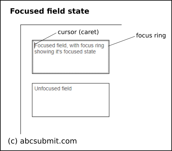 A input (field) is considered to be in it’s focused state if:
– The user, by pressing the TAB key, moved the cursor inside that input
– The user pressed that input with the left mouse button
– The user pressed on a label field associated with that input
Typically, the focused state of fields is associated with a focus ring and optionally a cursor (if the field supports text input) indicating you that you can perform a keyboard interaction with that input.
3.5.1. Background color (:focus input state)
Allows you to set a default background color of fields when they are in their focused state
3.5.2. Border color (:focus input state)
Allows you to set a default border color of fields when they are in their focused state.
3.5.3. Border style (:focus input state)
Allows you to set a default border pattern for your inputs when they are in focused state. Note that not all inputs are supporting border settings.
3.5.4. Text color (:focus input state)
Allows you to specify a default color that your inputs will use to display their text when they are in their focused state.
3.6. Error input state (:error)
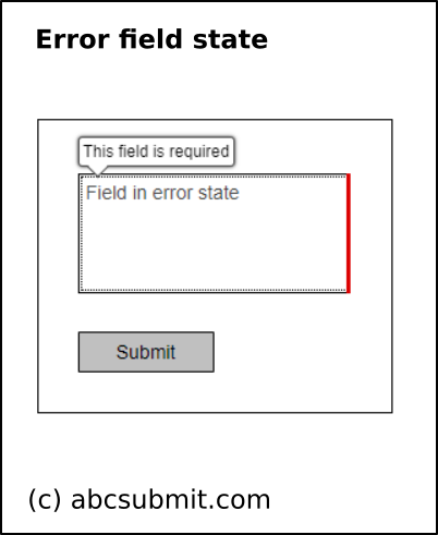 A input is considered to be in it’s error state if it’s validation failed. This group of settings let you configure the visual appearance of the inputs that encountered validation errors.
Use this group of settings in order to modify the appearance of inputs / fields of your form when they are in error state.
3.6.1. Background color (:error input state)
Sets the default background color of your form inputs when they are in their error state.
3.6.2. Border color (:error input state)
Sets the default border color of your form fields when they are in their error state. Note that not all form fields are supporting border settings.
3.6.3. Border style (:error input state)
Sets a default border pattern for your inputs when they are in error state. Note that not all inputs are supporting border settings.
3.6.4. Text color (:error input state)
Sets a default text color that the inputs will used to display their textual content when they are in their error state.
4. Button
From this group of settings you can control the default visual appearance of your form / website buttons. Note that individual button appearance settings will override these settings.
4.1. Text (of buttons)
Sets the default text settings of your form buttons
4.1.1. Font face (of buttons)
Allows you to set the default font for your form buttons (like Arial, Times new Roman, Courier, etc).
4.1.2. Font size (of buttons)
Set default font (text) size of your form buttons.
4.1.3. Font style (of buttons)
Set default text decoration that your buttons will use when they are rendered on screen. Allowed settings are: Bold, Italic and Underline.
4.1.4. Text alignment (of buttons)
Set default alignment of text inside form buttons. Allowed settings are: Left, Center, Right and Justify.
4.2. Border (of buttons)
From this group of settings you can set default visual border settings that your buttons will use. Note that individual button border settings will override these settings.
4.2.1. Border width (of buttons)
Sets the default thickness (width) of the border that a button can have.
4.2.2. Rounded corners (of buttons)
Sets the default rounder corner settings that your buttons can have.
4.3. Normal button state (:normal, default state)
From this group of settings you can set the default visual appearance of your form buttons, when they are in their default (:normal) state.
A button is in it’s default (:normal) state if:
– User mouse pointer is not above it’s surface (:hover state)
– Focused form element is not that button (:focus state)
4.3.1. Background color (:normal state of buttons)
Sets the default background color of form buttons when they are in their default (:normal) state
4.3.2. Border color (:normal state of buttons)
Sets the default border color of form buttons when they are in their default (:normal) state
4.3.3. Border style (:normal state of buttons)
Sets a default border pattern that buttons in their default (:normal) state will use to draw their border.
4.3.4. Text color (:normal state of buttons)
Sets a default color of the text that your form buttons will use for their text when they are in :normal (default) state.
4.4. Hover button state (:hover)
A button is in’s :hover state if:
– User mouse pointer is situated above the button
4.4.1. Background color (:hover state of buttons)
Sets the default background color of your form buttons when they are in :hover state
4.4.2. Border color (:hover state of buttons)
Sets the default border color of your form buttons when they are in :hover state
4.4.3. Border style (:hover state of buttons)
Sets the default border pattern that your buttons will use to draw their border when they are in :hover state
4.4.4. Text color (:hover state of buttons)
Sets the default color of the text your buttons will use when they are in their :hover state (user mouse pointer is above them).
4.5. Focus button state (:focus)
A button is in it’s focus state if:
– The user navigated with the TAB key and moved the focus ring on that button (if user will press enter or space keyboard key, the button will be clicked)
– The button is not disabled
– The user pressed the button with the mouse pointer, and the button is displaying it’s focus ring.
Use this group of properties in order to set the default visual appearance of your buttons when they are in their focused state.
4.5.1. Background color (:focus state of buttons)
Sets the default background color of your form buttons when they are in their focused state
4.5.2. Border color (:focus state of buttons)
Sets the default border color of your form buttons when they are in their focused state
4.5.3. Border style (:focus state of buttons)
Sets the default border pattern (style) that your buttons will use when they are rendered on screen in focused state
4.5.4. Text color (:focus state of buttons)
Sets the default text color that your buttons will use when they are drawn on screen in focused state mode.
4.6. Pressed button state (:pressed)
A button is considered in it’s pressed state if the following conditions are met:
– Button is not disabled
– User mouse pointer is over the button surface
– Left mouse button is pressed over that button (and not released yet)
– When the user pressed the left mouse button, the press event occurred above the same button
Use this group of settings in order to control the default visual appearance of buttons which are in their pressed state.
4.6.1. Background color (:pressed state of buttons)
Sets the default background color of your form buttons when they are in their pressed state
4.6.2. Border color (:pressed state of buttons)
Sets the default border color of your form buttons when they are in their pressed state
4.6.3. Border style (:pressed state of buttons)
Sets the default border pattern (style) of your form buttons when they are in their pressed state
4.6.4. Text color (:pressed state of buttons)
Sets the default text color your buttons will use when they are in their pressed state.
5. Label
Use this groups of theme settings in order to control the default visual appearance that your field labels will use. Note that individual label appearance settings will override these ones.
5.1. Text (of labels)
This group of settings controls the default text settings that your form labels will use
5.1.2. Font face (of labels)
Sets the default font (face, family) that your form labels will have
5.1.3. Font font size (of labels)
Sets the default font (text) size that your form labels will use in your form
5.1.4. Font style (of labels)
Allows you to make default font settings adjustments on labels text (Bold, Italic, Underline)
5.1.5. Text alignment (of labels)
Set default text alignment in your labels (Left, Center, Right, Justify) of your form created using AbcSubmit form builder.
5.2. Text color (:normal state of labels)
Sets the default color of the text of your form labels when they are in their default state.
5.3. Text color (:focus state of labels)
Sets the default text color of your labels, when their associated field (input) is in focused state.
5.4. Text color (:hover state of labels)
Sets the default text color of your label fields, when their associated field (input) is in hover state.
5.5. Text color (:error state of labels)
Sets the default text color of your label fields, when their associated field (or input) is in error state.